The world of infographics has produced a race between designers.
The Internet is flooded with hundreds of infographics every day, so those graphics with good design and novelty features have a big leg up against competition in the race for eyeballs.
Often this prioritizes design above other traditional goals of data visualization, and charts get tweaked and embellished. This makes them more eye-catching and more memorable (PDF), but what about accuracy?

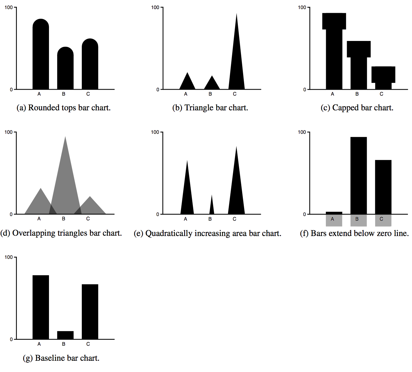
When designers turn a bar into a triangle, round the corners, or add a shape to the ends, they have an impact on how our perceptual system is taking in the bar chart’s information.
But our knowledge of how well bar charts work is all based on standardized bar charts with sharp corners and rectangular bars. Without a complete understanding of how these chart changes impact the chart’s ability to communicate, we can’t be confident that infographics are still doing a good job of informing.
We decided to test this through a user study exploring how accurately embellished bar charts communicate their data.
The user study targeted a set of six different embellishments that occur commonly throughout infographics, testing them all against a standard baseline bar chart. There are two main tasks that we tested: interpreting the exact value of a single bar, and interpreting the relative value between two bars.
Four out of six embellished charts performed worse than the standard bar chart at communicating their data.
We found that triangular bars, overlapping triangles, quadratically increasing triangles, bars with rounded ends and bars with caps all performed significantly worse when comparing between bars.
For telling the absolute value, quadratically increasing triangles performed significantly worse, with triangular bars, overlapping triangles and bars with rounded ends also performing worse, although the difference is not statistically significant.
Capped bars may be okay for absolute comparison tasks, and bars that extend below the x-axis performed roughly equivalently to the standard bar chart. If you’re interested in the full results, you can check out the paper here.
This doesn’t mean that these changes to charts are always a bad thing. Infographics serve many goals, and, as with all design, these goals must all be balanced against each other to find the best end result.
The results of this research let designers know the implications of their embellishment choices, and should help them balance these choices against an infographic’s goals.
This research was done by Drew Skau, Lane Harrison, and Robert Kosara. Drew Skau is Visualization Architect at Visually and a PhD Computer Science Visualization student at UNCC with an undergraduate degree in Architecture. You can follow him on Twitter @SeeingStructure